01
What this is
This packet is the complete kit for redesigning the home page: every section, every sentence of text, every color, every font, the logo, and every photo and video currently on the page, all collected in one place. Nothing about the live site changes because this document exists. It only ships once you have looked it over, made your choices, and told us what you want built.
02
The page, piece by piece
Think of the home page like a house with rooms in a fixed order: you walk in through the entryway, pass through a hallway of instructions, into a den with the switches on the wall, past photos on the mantel, and out through the exit, where the fine print is stuck to the door. Below is every room, in order, with a plain description of its job and the exact words it holds today.
1. Header
The bar that sits at the very top of every page on the site, the same way a store has a sign and a doorbell by the entrance. It shows the Greenlight name and, on the home page only, two buttons for people who are not signed in yet.
Brand name
Greenlight
The second half of the name, "light," is set in the brand green.Buttons
"Log in" and "Sign up"
2. Hero
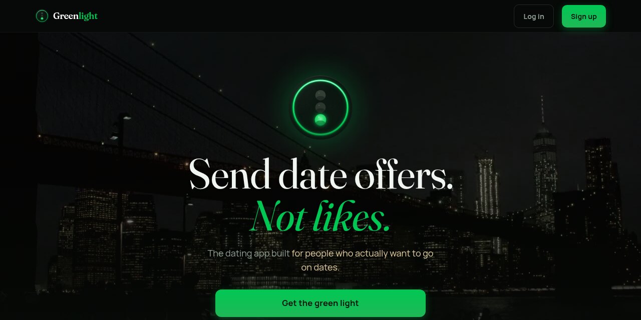
The big introduction at the top of the page, the equivalent of a shop window display. A looping video plays behind large text and one main button.
Main headline
Send date offers.
Not likes.
Supporting line
"The dating app built for people who actually want to go on dates."
Buttons
"Get the green light" and "Already have an account? Log in"
3. Trust strip
A short row of three quick facts, like the three small icons a hotel puts under its name to say free breakfast, free parking, pool. It exists to reassure a new visitor in about two seconds of reading.
The three facts
Included: ID verification
You: set your windows
0: endless chats
4. How it works
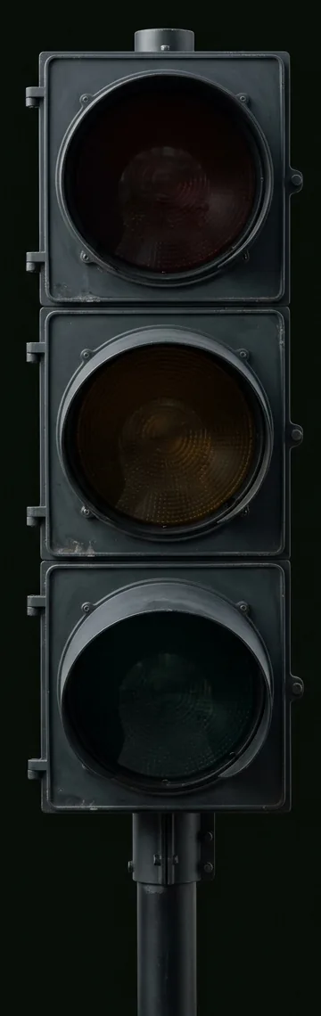
A three step explanation of using the app, next to a graphic of a traffic signal that lights up red, then amber, then green as you scroll, matching the three steps.
Section heading
Three steps to a real date.
Step 1: Discover with intent
"Browse curated profiles and see exactly when they are free: no guessing, no 'let's figure it out later.'"
Small line underneath: "Real people. Real availability."Step 2: Send a date offer
"Propose something specific: an activity and a place. Thoughtful beats a like."
Small line underneath: "Be clear. Be specific. Be intentional."Step 3: It's a date
"They accept, chat unlocks, and a countdown to your date begins. When the date arrives the chat closes, because the point was never to keep texting."
Small line underneath: "Real dates. Not pen pals."5. Benefits panel
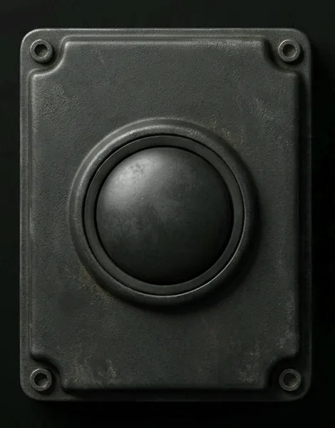
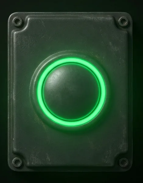
A hands on widget styled like a piece of physical equipment, a metal panel with five switches. Clicking a switch shows its explanation, the way flipping a breaker in a fuse box shows you which room it controls.
Section heading
Built on respect, consent & intention.
Switch 1: Offers, not likes
"Skip the small talk. Send a concrete plan and get to the date."
Switch 2: Real availability
"See open windows and propose a time that genuinely works."
Switch 3: Verification, built in
"Verify your ID and photos to earn the Verified badge, so when you see one, you know who you're meeting."
Switch 4: Messaging unlocks at yes
"Chat opens only once a date is confirmed. No creeping DMs."
Switch 5: Safety is the foundation
"You control your own availability. Share your ETA and an emergency contact. Your location is never shared automatically. Report or block anytime."
6. Story cards
Four photo and quote pairs, like postcards pinned to a corkboard, each painting a little scene of a date that started from an offer.
Section heading
The kind of date an offer can start.
Opening lines
"One clear offer beats a hundred unanswered hellos."
"Illustrative scenarios. Our members write the real ones."
Card 1: "Picture an offer like this"
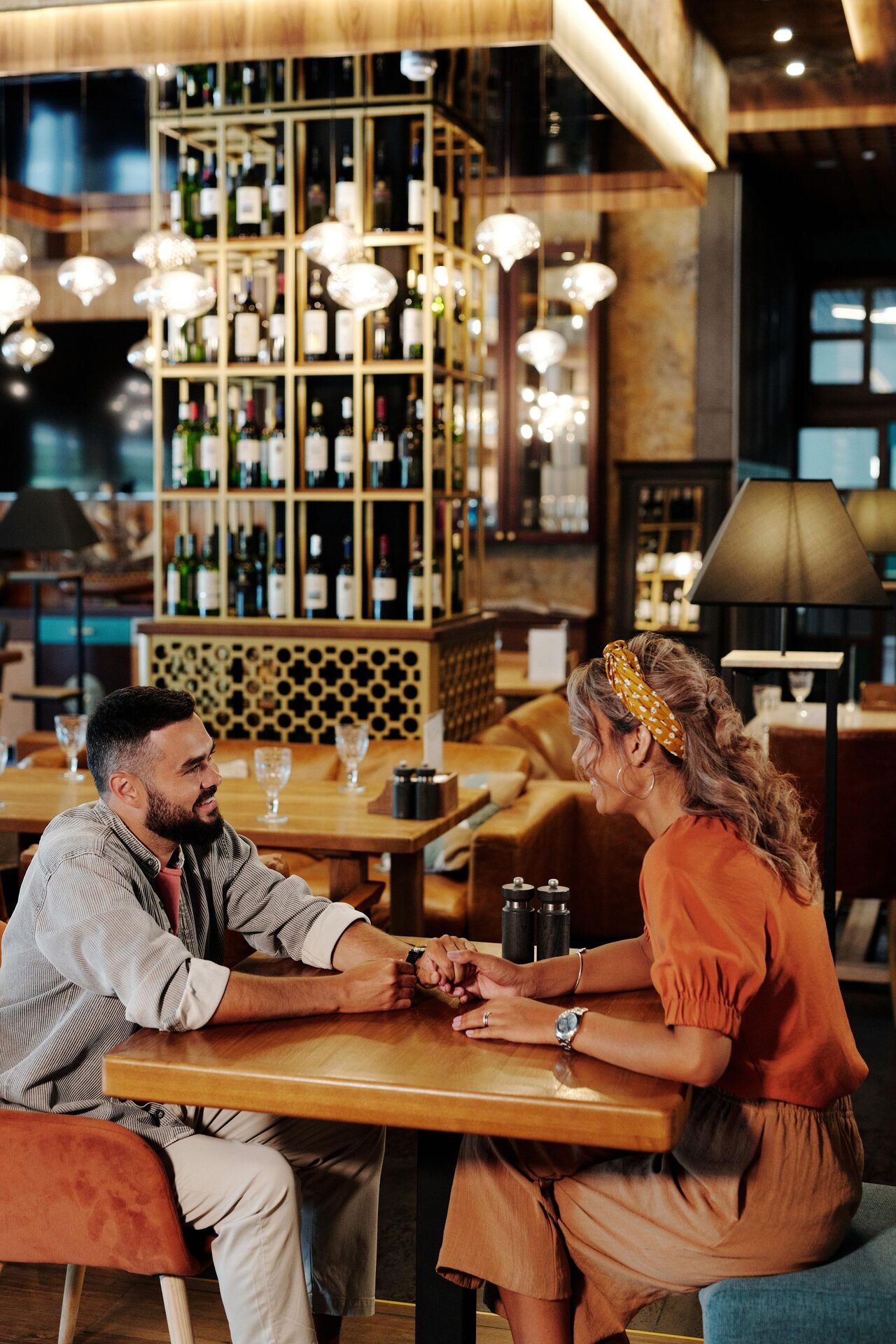
No "hey." Just an offer: Tuesday, 7 PM, a tiny natural wine bar in the neighborhood. She had three open windows that week and picked it. Two glasses of Barolo later, a date meant to end at nine ran well past midnight.
Card 2: "Or something this simple"
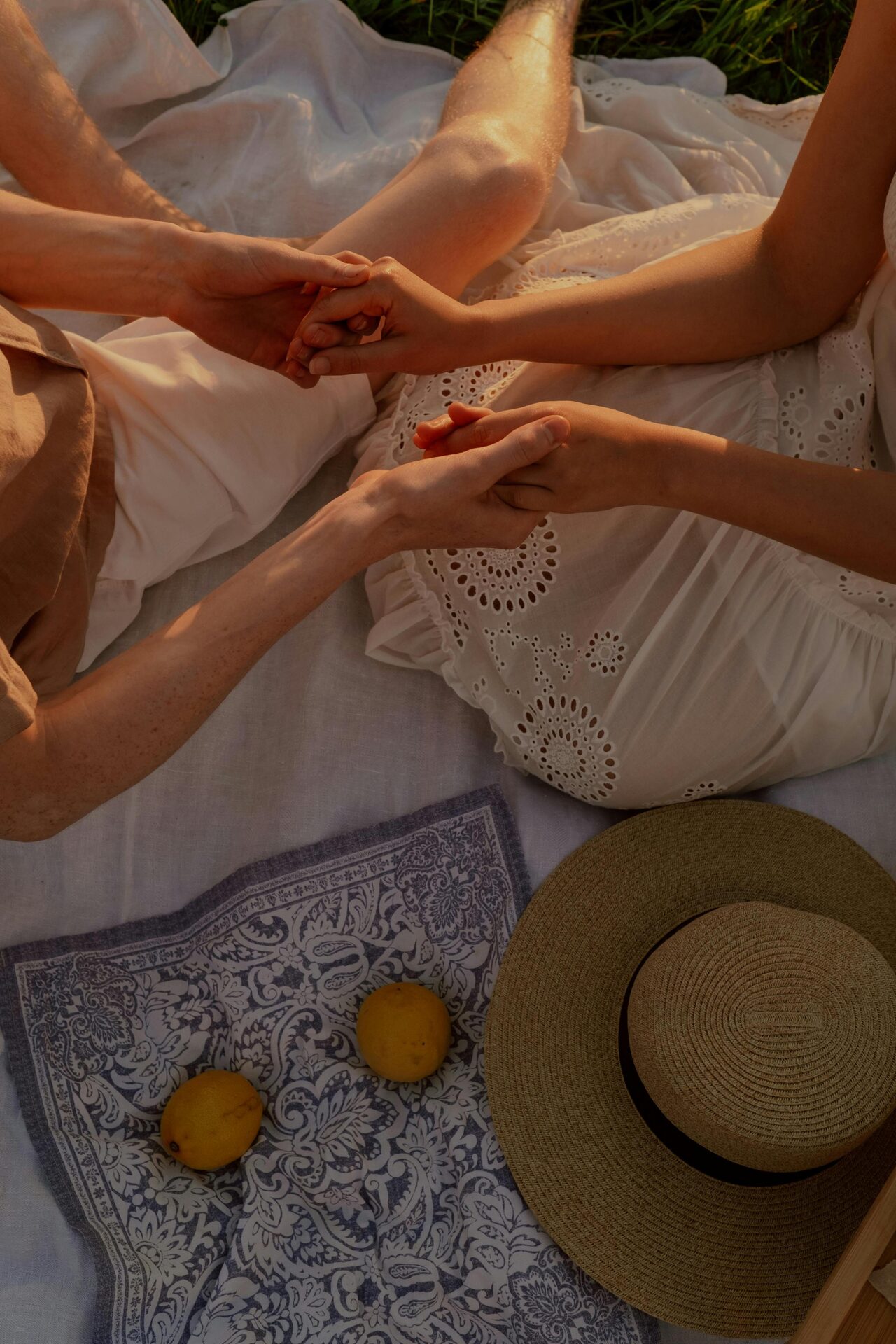
The offer was almost too simple: a Sunday picnic, lemons from the market, no plan after. He marked himself free and said yes. Now they argue happily over who packs the better basket.
Card 3: "Or a date that becomes a routine"
She almost scrolled past, then saw a real offer for Thursday dinner at her favorite waterfront spot. He'd read her profile. He'd chosen the place on purpose. The first date became every Thursday since.
Card 4: "Or a plan worth remembering"
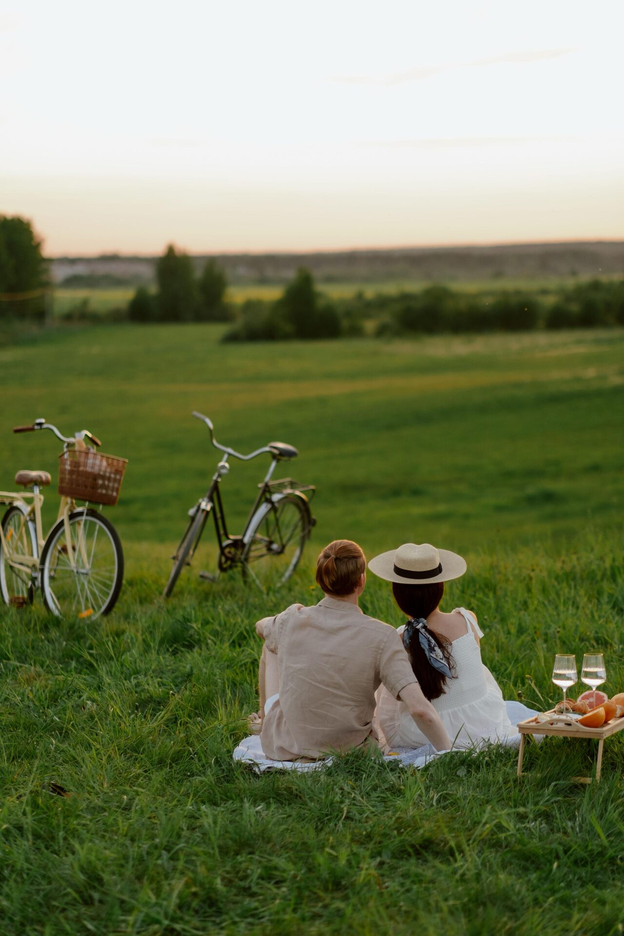
The offer was a bike ride out of town and a picnic at golden hour. She set a Saturday window; he planned the rest. Somewhere past the second hill, neither was thinking about the app anymore.
7. Final call to action
One last invitation to sign up before the page ends, the equivalent of the register at the front of a store on your way out.
Heading
Your green light is waiting.
Buttons and note
"Sign up" and "Already have an account? Log in"
Small note underneath: "The Greenlight web app is live now. The mobile app is coming nationwide soon."8. Footer
The bottom strip on every page site wide, the same way every receipt ends with a return policy and a thank you line. Because it appears on every page, not only the home page, a change here shows up everywhere.
Tagline (the official slogan, must always read exactly this way)
"A better way to date."
Link columns
Product: Pricing, Safety
Legal: Privacy Policy, Terms of Service, Refund Policy, Acceptable Use, Law Enforcement Requests
Contact: support@greenlightdate.com
Bottom line
"Web app live now · Mobile app soon" and "© 2026 Greenlight. All rights reserved."
03
The current colors
Every color on the home page today, the way a hardware store keeps a wall of paint swatches, each with its own number so you can order the exact same paint again. The code next to each name below is that paint swatch number: give it to us and we mix the exact color, no guessing involved.
| Swatch | Plain name | Code | Where it shows up | In a cream redesign |
|---|---|---|---|---|
| The near black background | #070b08 | The color behind the entire page | Would change | |
| The secondary dark background | #0a100c | Behind a couple of sections, slightly different from the main background | Would change | |
| The card surface color | #0f1611 | Behind the switch panel and story text boxes | Would change | |
| The secondary card surface | #131c16 | A slightly lighter card color used in a few spots | Would change | |
| The thin divider line color | #1e2a22 | The faint hairlines that separate sections | Would change | |
| The main text color | #f1f5f1 | Headlines and most body writing (near white, for reading on the dark background) | Would darken, to read on a light background | |
| The secondary muted text | #94a398 | Captions and smaller supporting text | Would darken | |
| The faintest text | #6e7c72 | Fine print and the least important labels | Would darken | |
| The main brand green | #00c753 | Every button, link, and the glowing ring on the logo | Stays, this is the brand anchor | |
| The secondary green | #1fb857 | Pairs with the main green in the smooth blend on buttons | Stays, paired with the brand green | |
| The deep green | #0e3d22 | A darker green used for depth in a few spots | Likely stays | |
| The gold accent | #e3cea0 | The footer tagline, and the italic emphasis words in headings ("real date," "consent & intention") | Stays, it is the secondary brand color |
04
The fonts and sizes
The page uses exactly two typefaces, on purpose, the same way a nice restaurant menu uses one clean typeface for the dish names and one fancier one for the section titles like "Starters." This document is set in those same two fonts, so you are reading a live example right now, not just a description.
The everyday font
Familjen Grotesk
The statement font
Fraunces
On a full size desktop screen, the hero headline runs about 84 pixels tall and the regular reading paragraphs run about 17 to 19 pixels tall. Everything shrinks together, in proportion, on a phone.
05
The logo
The mark is not two dark circles and a green dot laid flat. It is built to look like a real physical object: a round metal badge (imagine a polished pocket watch case) with a vertical stack of three traffic light lenses set into its face. The top and middle lenses sit dark and unlit. Only the bottom lens is lit, glowing green, exactly like a real traffic light showing "go."
The badge shape, the dark unlit lenses, and the one glowing green lens are the whole idea of the brand in a single object: a signal that says "you are clear to go." A redesign can change the surrounding colors of the page freely, but this mark, and the meaning of "bottom light, green, lit" is the one piece of visual identity we would strongly recommend keeping recognizable.
There is no separate flat or simplified version of this mark today. Every place it appears uses this same round badge, just at different sizes (as small as 28 pixels tall in the header, as large as 132 pixels tall in the hero).
The separate saved copies that would need manual updating
favicon-v4.svgThe small icon shown in a browser tabfavicon.icoA backup version of that same tab icon, for older browsersapple-touch-icon-v3.pngThe icon that appears if someone saves the site to an iPhone home screenemail-logo.pngThe logo image inside every email Greenlight sendsopengraph.jpgThe preview picture shown when a Greenlight link is pasted into text messages, iMessage, or social apps
06
Pictures and video on the page
Below is every photo and video file currently loaded on the home page. A staged folder with copies of all of these, plus the logo and the color list above, is ready to hand to the team once it is approved to go out.
Hero background video
The looping video playing behind the top headline. There is one version cut for wide desktop screens and a separately cropped version for tall phone screens, so faces stay framed properly on both. This one was filmed for Greenlight, not stock footage.
hero-loop-v4.mp4 / .webm (desktop)
hero-loop-mobile-v4.mp4 / .webm (phone)
Hero fallback pictures
Still frames shown instead of the video if a phone or browser will not play it, or if someone has motion reduced in their settings.
hero-poster-v4.jpg (desktop)
hero-poster-mobile-v4.jpg (phone)
Story photos (four)
The four couple photos next to the made up date scenes. These read as licensed stock photography, a different style from the brand filmed hero video, and are the easiest pictures to swap for something new.
couple-1.jpg, couple-2.jpg, couple-3.jpg, couple-4.jpg
Switch panel graphics (two)
The "on" and "off" look of each switch in the benefits panel, styled to look like a physical metal toggle.
button-off.webp, button-on.webp
Traffic signal graphic
The tall vertical graphic next to the "how it works" steps, styled to match the logo's traffic light idea, with its three lights glowing in sequence as you scroll.
signal-head.webp
07
Downloads
Everything above, as real files you can open, forward, or hand to a designer. Think of this the way movers pack a truck: one big box with everything in it for a single trip downstairs, and every item also sitting out separately in case you only need the lamp and not the whole box.
Grab everything
One file with every asset below already inside it: logos, photos, video, and the two files made for AI tools.
greenlight-redesign-kit.zip
For your AI tools
Made to be uploaded or pasted straight into a tool like ChatGPT, Claude, or a design assistant, so it can read the whole kit without you retyping any of it.
-
kit.mdThis entire document, converted to plain text with headings, so an AI tool can read the whole page map, copy, colors, and fonts in one paste Download (16 KB) -
colors.jsonThe color table from section 03, structured as data (name, code, where it is used, what changes in a cream redesign) instead of a picture of a table Download (4 KB)
Home page video and photos
hero-loop-v4.mp4Hero background video, desktop versionDownload (3.5 MB)hero-loop-v4.webmHero background video, desktop, alternate formatDownload (3.1 MB)hero-loop-mobile-v4.mp4Hero background video, cropped for phone screensDownload (1.8 MB)hero-loop-mobile-v4.webmHero background video, phone, alternate formatDownload (1.6 MB)hero-poster-v4.jpgHero still frame shown if the desktop video will not playDownload (236 KB)hero-poster-mobile-v4.jpgHero still frame shown if the phone video will not playDownload (104 KB)couple-1.jpgStory card photo, "Picture an offer like this"Download (388 KB)couple-2.jpgStory card photo, "Or something this simple"Download (336 KB)couple-3.jpgStory card photo, "Or a date that becomes a routine"Download (392 KB)couple-4.jpgStory card photo, "Or a plan worth remembering"Download (244 KB)button-off.webpBenefits panel switch, "off" positionDownload (24 KB)button-on.webpBenefits panel switch, "on" positionDownload (16 KB)signal-head.webpTraffic signal graphic next to the "how it works" stepsDownload (20 KB)



Logo and brand marks, current (live on the site today)
greenlight-logo-mark.svgThe master logo artwork, scalableDownload (8 KB)greenlight-logo-mark.pngThe master logo artwork, flat imageDownload (16 KB)favicon-v4.svgThe small icon shown in a browser tabDownload (8 KB)favicon.icoBackup tab icon for older browsersDownload (16 KB)apple-touch-icon-v3.pngIcon used when the site is saved to an iPhone home screenDownload (32 KB)email-logo.pngThe logo shown inside every email Greenlight sendsDownload (20 KB)opengraph.jpgThe preview picture shown when a Greenlight link is shared in texts or social appsDownload (80 KB)
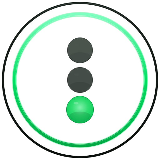
The new approved hearts logo (drafted for review, not live yet)
hearts-logo.svgThe new hearts logo, master artwork, scalableDownload (12 KB)hearts-logo-512.pngThe new hearts logo, large flat imageDownload (264 KB)hearts-logo-128.pngThe new hearts logo, medium flat imageDownload (24 KB)hearts-logo-48.pngThe new hearts logo, small flat image, icon sizeDownload (8 KB)GreenlightLogoHearts.tsxFor whoever rebuilds the site: the code version of the new logo, ready to drop into the appDownload (12 KB)

The color list, plain text version
colors.txtThe same color list as section 03, in a plain text file instead of a webpage tableDownload (4 KB)
08
What we need back from you
You do not need design software or any technical skill to hand this back to us. Send it however is easiest.
- 1Your new look, in any form. A Figma file if someone on the team has one, a Canva mockup, a screenshot of the current page with notes drawn on top, or even a photo of a hand sketch on paper. All of these are equally usable starting points for us.
- 2The colors you picked. If you are not working from a design tool that gives you exact codes, even a phone photo of paint chips, fabric swatches, or a screenshot of a color you like somewhere else on the web is enough. We will translate whatever you send into the exact codes shown in section 03.
- 3Any wording changes. If you want to reword, shorten, or reorder any of the text in section 02, mark it up directly or just tell us in plain language what should change.
Once we have that, we build it to match exactly and show you a working preview before anything goes live on the real site.
09
Before pictures, for markup and reference
The full home page as it looks live today, top to bottom, on a laptop screen and on a phone screen. Save either image and draw directly on top of it if that is the easiest way for you to sketch out changes.

Laptop screen width, full page, top to bottom

Phone screen width, full page, top to bottom